
As usual since March, most of us have been concerned about the development of COVID-19. After a pause of a couple of months in which the pandemic seemed to take a short break thanks to the spring confinement, the alarm bells rang again at the end of August and with each new day the situation seems to grow more alarming. Apparently, it is clear to a large part of the public that some kind of measure must be taken to put a stop to this second wave that is beginning to engulf us. Can mathematics help us to know what is happening and/or help us to make decisions? The answer is, logically, yes (otherwise I would not be writing this post –which, by the way, is my first time– on the IMUS Blog), although there are some nuances, as we shall see.
First of all, there is some background (if you don’t want to read a mathematical mumbo-jumbo, you can skip a couple of paragraphs). The results I am about to present are based on several compartmental epidemiological models that I have been involved in developing. Compartmental models are based on the following premise: within an epidemic, the population can be distributed in different “compartments”, such as susceptible population (the one that can be infected), infected and contagious population with or without symptoms, exposed population (infected but not contagious), hospitalised population, recovered population or deceased population. In addition, the population “moves” from one compartment to another with a certain probability and stays for a period of time in each compartment (SEIR models and similar are compartmental examples, see the entry Analysis of Covid-19 using a SEIR model).
In the compartmental model used for our analysis we have assumed that its dynamics is deterministic, so it can be described by differential equations. Thus, the model parameters (times and probabilities) are obtained through an optimisation process with respect to the curves of detected cases and/or deaths similar to the least squares adjustment (although more complex since these curves are not given by analytical functions). We also assume that the population is homogeneously distributed in each compartment, i.e. the compartmental model applies to the entire population of a city, region or country, regardless of the spatial distribution of the population.
(If you skipped the mathematical ramble, you can continue from this point onwards.)
There is one very important thing to keep in mind with the results I am going to show: they belong to a mathematical model. But this is not the only existing model. In the same way that weather forecasts depend on the model used (you only have to look at different weather websites to see that they offer different forecasts), the same situation applies here. Besides, the future of the epidemic also depends on political decisions and people’s behaviour, which are absolutely unpredictable. Moreover, a recently published paper demonstrates, using Bayesian statistics, that it is impossible to predict the peak or the end of the epidemic. This is mainly because the uncertainty of predictions increases over time. Thus, analogous to weather predictions, we will show the most likely outcomes. However, as I said above, the model cannot predict human behaviour, and therefore the results shown would be a prediction of what would happen if the current scenario did not change.
As the title of the post reads, we are going to show what results the compartmental model offers for Andalusia. To do so, we have assumed that the data provided by the Junta de Andalucía for hospitalisations, cases and deaths are valid, and we have adjusted the model to the data provided by the Junta so that time 0 corresponds to the 1st of August and the final time corresponds to the latest data provided by the Junta, i.e. the 30th of September.
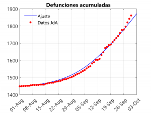
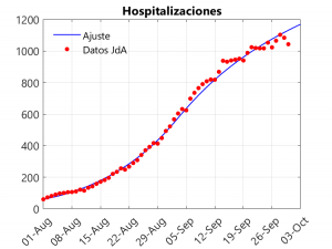
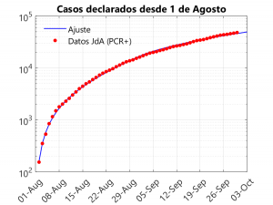
These three graphs show the closeness of the fit. If anything, there is a small underestimation of deaths in the last three days, compensated for by an overestimation of hospitalisations on these dates. The adjustment considers that, from the beginning of September onwards, a slowdown in the rate of growth of cases is observed. To understand this phenomenon and to see how it affects the model, it is necessary to talk about the transmission rate.
The transmission rate is the most complex parameter to define in epidemiological models, as it belongs to a non-linear term and is the one that most strongly depends on human behaviour (the rest of the parameters –incubation time, probability of hospitalisation, time of death…– basically depend on the behaviour of the disease). Roughly speaking, it could be defined as the product of the number of contacts times the viral load (see this article for a discussion on the subject). Based on this definition, it is more or less clear how the parameter can be controlled: the number of contacts can be reduced by social distancing or confinement, while the viral load can be reduced by wearing masks, ventilating rooms, keeping people more than 2 metres apart (not 1.5 metres as some politicians say), coughing or sneezing into the elbow, washing hands, speaking in a low voice, etc.
If we do not allow the model to reduce the transmission rate from 2 September onwards, it is not possible to get a good fit. Consequently, it is clear that there has been a reduction in this rate. Why? Well, I imagine that it is because on holidays a large part of the population has ignored many “safety” rules and, once at home, people have been more cautious. Moreover, not having to make a second change in transmission rates to allow for a good adjustment is a sign that the return to school has not had a noticeable impact on infections. In fact, what is likely to be happening is that most mass infections are occurring in indoor settings where masks are not worn (and even loud talking takes place), such as bars, restaurants, nightclubs or celebration halls.
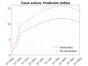
And what does the model predict? Well, let’s take a look at the graphs below:
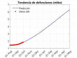
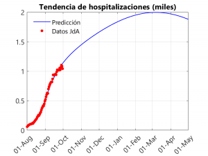
In the first graph, we notice an exponential (albeit slow) growth in deaths that becomes linear from November-December onwards. As can be seen in the following graphs, the peak of the second wave seems to be far away (between February and March), thanks in part to the slow growth in cases and the drop in the transmission rate that took place in September. In any case, we have a litmus test from the 5th (at least in Seville), with the return of university teaching in the University… and during the month of October with the arrival of the cold and the shortening of the days (and the consequent confinementnt of the population) and the increase in flu and colds. Another thing to note is that the peak of hospitalisations is around 2000, below the peak of 2700 reached in the first wave… However, this does not mean that the health system may not be saturated, as this result applies to Andalusia as a whole, and some hospitals may be saturated.
As most of us think, there must be a number of unreported cases in the reports given by the different governments. These cases tend to be mainly asymptomatic (although there will also be symptomatic cases that, due to system saturation, are not tested for PCR). On the other hand, in the reported cases, there are also asymptomatic cases, as contacts of symptomatic persons are being tested for PCR even if they do not show symptoms. Given that in the data provided by the Junta it is difficult to find out what percentage of the positive PCRs correspond to asymptomatic people, we have decided to separate the infected people into declared and non-declared. Thus, it can be seen that, in general, the number of undeclared infections is about 2/3 of the total… In other words, the number of unreported cases is twice as high as the number of reported cases. This can be seen in the third graph, which shows the active (non-hospitalised) reported and unreported cases (on this, see also in this Blog the entries Sero-epidemiological study of coronavirus: preliminary report and some conclusions and Even now, confinement can save lives).
A couple of final notes regarding results not included in the graphs. The first one refers to the fact that the model allows us to estimate the basic reproductive number (the famous R0) at the beginning of the second wave (1st August) and after the return from holidays (2 September), obtaining that its value is, respectively, 1.65 and 1.07. If this number is less than 1, we can say that the epidemic is under control. Therefore, we are quite close to control, and, in fact, we can see that the growth in deaths is slow. If we make a little effort, using the hygienic measures outlined above, as well as greater social distancing, we can bring the infection curve down. Companies, government agencies and universities can also help to reduce the number of contacts by encouraging teleworking.
The second final point concerns herd immunity: would it be possible in Andalusia in the light of the model’s predictions? Well, despite reaching more than 5000 deaths in 6 months, only 10% of the population would be infected (we do not know if it would immunise, as the probability of re-infection is not yet known). In other words, only a vaccine could help us to survive the pandemic… Or wait five years, provided the virus does not mutate and/or immunity is perennial.
A ver si algún gobernante tiene un poco de tiempo para leer artículos como este y aplica algunas de las ideas que subyacen.
Cordial saludo.
Excelente contenido y articulo, los problemas que se abordan son geniales, las situaciones y los problemas de conectividad son verídicos, a veces cuando se dan clases la conectividad juegan un papel muy importante ya que perder el hilo en el alumno es fatal, también recomiendo este lugar en donde se habla de las matemáticas de manera general, muy bien. me gustaría trabajar en conjunto para enlazarte en un articulo de mi blog quedo atento.
https://www.clasesdematematicas.co