
Since covid-19 was declared as a pandemic by the World Health Organisation (WHO), thousands of words have been written about it. Given its global impact, thousands of researchers have spent months studying the disease and the number of scientific papers related to covid-19 is staggering. There are so many studies that it is almost impossible to keep up with them all. Media reports are counted in the thousands per day (for example, typing the word covid-19 into the google search engine brings up more than six billion entries). In these very pages we have done our bit, with the help of mathematics, to help understand many of the issues related to this disease. In this post we aim to review some of these issues and to show, once again, how science in general and mathematics in particular are needed for decision-making by health (and political) authorities and also for rigorous reporting of the situation. In particular, we will estimate the speed of infection in this third wave in which we are immersed, which, as we will see, is almost four times higher in Seville and five times higher in Andalusia, which, taking into account the seriousness of the second wave, is more than worrying.
We will begin by recalling that what started out as just another flu has become a global pandemic. A consultation of the magnificent database of the Johns Hopkins University (22 January 2021) gives us the horrifying figures of almost one hundred million people infected worldwide (which is probably far from the real number, given that only cases detected and tested positive in one of the reliable tests are counted) and more than two million deaths. Initially it was thought that the mode of transmission was solely and exclusively through Flügge droplets (the droplets of saliva that we expel mainly when talking, coughing or sneezing), but a large number of studies revealed that a not negligible means of transmission was also through aerosols (microscopic droplets that are suspended in the air mainly when we breathe). We have discussed this in several posts (e.g. here, here and here). It is therefore essential to maintain a safe distance between people, wear a mask and reduce crowding, especially in enclosed and poorly ventilated places.
To avoid unfounded speculation, whether for political or other interests, it is advisable to make decisions on the basis of proven scientific facts, i.e. to make use of Science (with capital letters). An example of this is the role played by aerosols in explaining covid-19 infections. Initially scorned as a source of contagion, they are, today, a route that is becoming increasingly important and is, for many experts, the main route of contagion.
Similarly, the use of infection data in decision-making must follow certain rules, such as using consolidated data (discussed here) or properly justified estimates. This is not a “no-brainer” as data can be used in a variety of ways and interpreted as appropriate (and not for the first time). In fact, the results of a research project may depend not only on how the experiments are conducted, but also on how the results are analysed and interpreted. Believe it or not, “numbers” can be interpreted in many different ways, as A. Durán explains in his post Hunger and numbers of 21 November 2016, or Professor Kit Yates in response to the controversial question Do you think the media and politicians manipulate the figures?
At this point we will try to show why the third wave in which we are immersed is even more worrying than the previous two. To do this, the first thing we are going to do is to remember that contagion data must be consolidated, because as we have already explained (here), the data published daily only reflect reality with a delay of between five and seven days.
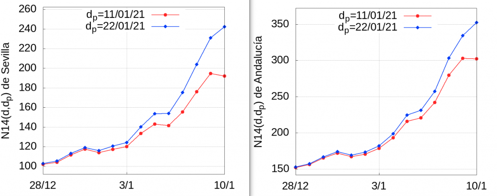
For the example under discussion, we will estimate the error made if we use the data on the number of infections detected and confirmed on 10 January, published on 11 January 2021 (one day later), and the same data updated on 22 January (with data collected up to 21 January, 11 days later). For this we will use the method explained in the above-mentioned post. The number of infections accumulated in 14 days per hundred thousand inhabitants of the day \(d\) published on the day \(d_p\) will be denoted by \(N14(d,d_p)\) and we will call it the N14 index. Thus, \(N14(10/01/21,11/01/21)\) is the cumulative infection rate on 10 January based on the infection data published on 11 January (the day after), while \(N14(10/01/21,22/01/21)\) is the cumulative rate over 14 days using the data published on 22 January (i.e. updated to 21 January).
The following graphs show the evolution of \(N14(d,11/01/21)\) and \(N14(d,22/01/21)\) between 28 December 2020 and 10 January 2021 based on data taken on 11 January and 22 January in Seville and Andalusia, respectively:
 In the following table you can see the error over 14 days:
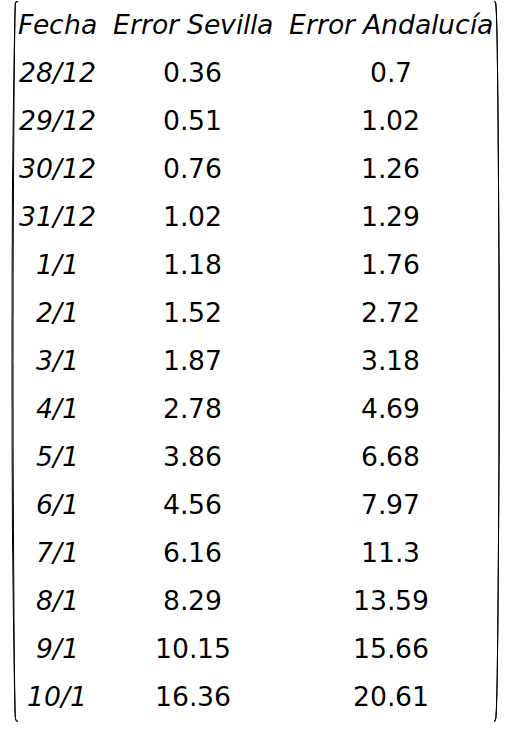
As can be seen, the error increases as we get closer to the day of publication. In other words, if we want to have an approximate idea of the index accumulated in 14 days in Seville on 21 January, and the data we have is the one published on 22 January, according to the table above we will be making a relative error of approximately 20%, and in the case of Andalusia 14%. That is to say, if we calculate the value of this index in Andalusia we obtain \(N14(21/01/21,22/01/21)=796.8\), but given that the relative error committed is 14%, a value closer to the real one will be \(796.8/(1-0.14)=926.5\). A similar calculation for Seville gives us \(N14(21/01/21,22/01/21)=590.5\), a more realistic estimate being \(590.5/(1-0.2)=738.1\). We have to do the same with the values of \(N14(p,22/01/21)\) for the previous days taking the values of the error of each day (for January 20 we take the value of the error of January 9, etc). This estimate will be closer to the real values than using the figure published on 22 January. Of course, we do not know the relative error a priori, but we can assume that over one or two weeks after 10 January the errors will be reasonably close to those in the table above. We will apply this procedure at the end of this entry to estimate the N14 growth rate in the last week.
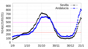
Having reliable data allows us, for example, to estimate the growth rate of the \(N14(d,d_p)\) curve. As an example we will compare the growth of the \(N14(d,d_p)\) index of the second and third wave (for the first wave no reliable data is available due to the lack of reliable tests at the beginning of the pandemic). A glance at the following graph of the evolution of \(N14(d,d_p)\) in Seville and Andalusia clearly shows two distinct waves of infections: the second wave, whose growth spikes around 1 October 2020 (a few weeks after the opening of schools and institutes, whose contribution to the growth of infections is not fully established for various reasons that do not need to be discussed here), and a third wave from 1 January 2021, just after the end of the year. At first glance, we can see that the speed of the third wave is significantly higher than that of the second wave. Let us estimate this speed in both cases.
From a mathematical point of view, calculating the rate of change of a curve is a very old problem whose solution requires one of the most important concepts of mathematical analysis: the concept of the derivative, a concept that should be familiar to everyone. Thus, if \(f(t)\) is a function that varies continuously in time, the rate \(v_f(t)\) with which \(f(t)\) varies at each instant of time \(t_0\) is expressed by the limit \(v_f(t_0)=\lim_{\Delta t\to 0}\frac{f(t_0+\Delta t)-f(t_0)}{\Delta t}\)..
However, our magnitude \(N14(d,d_p)\) is defined on a discrete set: the \(d\) days, so we must resort to the concept of average velocity \(\overline{v_f(t)}\). The average velocity cannot be measured at a specific instant of time but over an interval. For example, if we consider the time interval that begins at the instant \(t_0\) and ends at \(t_0+\Delta t\), the average velocity in this interval is
$$ \overline{v_f(t)}=\frac{f(t_0+\Delta t)-f(t_0)}{\Delta t}.$$
This is the formula we should use to estimate the speed of waves of contagion.
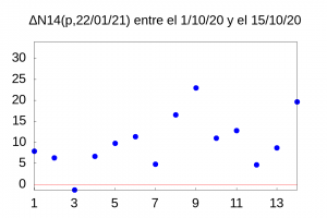
The first problem arises when deciding which interval to take. To have a more precise idea of the speed of our curve we should take the smallest possible \(\Delta t\) value, which in our case is 1, but this choice is not reasonable because, although the function \(N14(d,d_p)\) is smoother than the function of the daily number of infections (as we showed in a previous entry), its day-to-day variation has too many jumps as shown in the figure on the right.
What we will do, therefore, is to take for example one week, and adjust the value of \(N14(d,d_p)\) by means of a regression line (by the least squares method) \(y=m d +n\) where \(y\) represents the value of the index \(N14(d,d_p)\) and \(d\) the day in which we want to find the value of \(N14\). The value of the slope of this line, \(m\), will give us an estimate of the growth rate of the curve. Obviously there is a certain arbitrariness in taking \(\Delta t\) equal to 7 days (if we take fewer points the fit is worse and if it is very large we lose precision) but if we take into account that 14 days is considered to be the average incubation time of the virus, it seems reasonable to study the behaviour of the curve on a weekly basis.
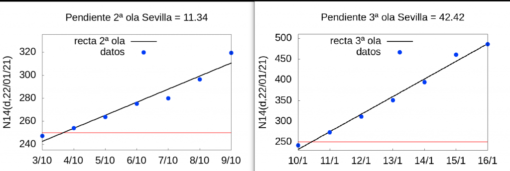
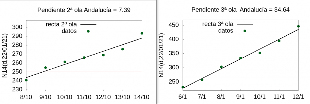
To estimate the rate of both waves, we have chosen as a starting point the day just before the 250 accumulated cases in 14 days per 100,000 inhabitants are exceeded, both in Seville and in Andalusia. The reason for this is twofold. On the one hand, fewer tests were performed throughout Spain over the Christmas period (the calculations are based on data from 21 January) (see the detailed analysis, for example, here) and therefore the data are not very reliable and, on the other hand, we are interested in comparing in both waves what happens when we exceed 250 accumulated cases in 14 days per hundred thousand inhabitants, a critical figure accepted by all, and which among other things indicates that infections are out of control.
Thus, for Seville we obtain the following estimates: the speed of the \(N14(d,d_p)\) index of the 2nd wave in Seville in the week from 3 to 9 October 2020 was 11.34 while that of the 3rd wave between 10 January and 16 January 2021 was 42.42, i.e. 3.75 times (almost four times!) faster. And we have not taken into account the correction due to the error caused by the delay in the counting and publication of the data, which as we have seen is approximately 5% for five days before the day of publication of the data (in our estimates we are taking the data published on 22 January 2021, i.e. we are using the data collected and updated up to 21 January). The following two graphs show the regression line plots for both waves in Seville.
Let us now see what happens in the case of Andalusia as a whole. The velocity of the \(N14(d,d_p)\) index of the 2nd wave in Andalusia in the week of 8-14 October 2020 was 7.39 while that of the 3rd wave between 6 January and 12 January 2021 was 34.64 (4.7 times faster).
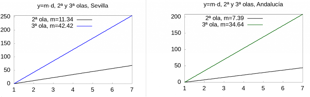
To give a visual idea of the rate of increase of the index, we will plot the function \(y=m d\) from day 1 to 7 for Seville and Andalusia:
Finally, let us estimate the rate of growth of the \(N14(d,d_p)\) index in the last week using the latest data available, i.e. from the week of 15 to 21 January 2021. If we use the data published on 22 January containing the detected and confirmed infections up to 21 January, we obtain that the velocity of the \(N14\) rate of cumulative infection is 24.91 and 31.78 in Seville and Andalusia, respectively. This may lead us to think that the rate of infection is slowing down. However, we must remember that the latest data do not reflect reality and the closer we get to the day of publication, the greater the error in the figures. We will correct, using the relative errors we calculated at the beginning of this entry, the infection values for the last week as follows: Instead of taking the corresponding \(N14\) values of the \(N14\) index between the 15th and 21st of January published by the Junta de Andalucía we take the corrected values as we explained at the beginning of the entry.
Thus, we have the following table
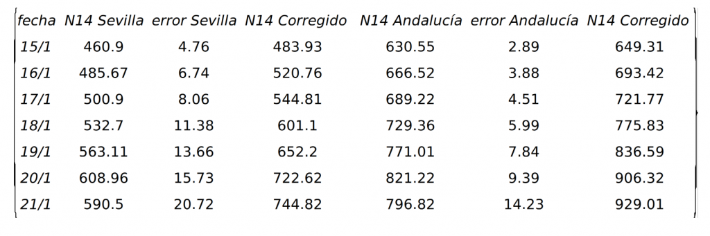
With these data, the rate of the \(N14\) index becomes 46.2 and 49.27 in Seville and Andalusia, respectively, values much closer to those we estimate for the rate at the beginning of the third wave. That is to say, if we correct the data we obtain that the rate of contagion is not decreasing, but rather that a high growth rate is being maintained and, therefore, the measures to be taken must be in the direction of decreasing contagion, since apparently with what has been done so far this rate is not decreasing, or as they say nowadays, the curve is not flattening out. In fact, with these values we can estimate how long it will take for the \(N14\) rate to reach 1000 cases per hundred thousand inhabitants using the formula:
$$ \Delta d = \frac{1000-N14}{\mbox{rate}}$$
Thus for Seville we obtain the value 5.5, i.e. 6 days and for Andalusia 1.4, i.e. two days.
To the above we must add that, as of today, there is no evidence that infections are decreasing, so it is time to take the necessary restrictive measures if we want to save lives, as it is obvious that the greater the number of infections, the more deaths there will be from covid-19, but not only that, there will also be deaths (the so-called collateral damage) due to the saturation of the Andalusian health system. It is worth concluding by stating that a similar analysis can be carried out for any other autonomous region for which reliable data on contagion are available.
Leave a Reply