
In this short entry we will revisit the issue of infection rates in the third wave of covid-19 (see previous post). In that entry we proposed a method to estimate the infection rate using the N14 index, namely the index \(N14(p,d_p)\) which denotes the number of infections accumulated in 14 days per hundred thousand inhabitants of the day \(p\) published on the day \(d_p\). For example, \(N14(10/01/21,04/02/21)\) is the cumulative infection rate on 10 January based on infection data published on 4 February.
Our objective is twofold. On one hand, we will show that the estimate we made for the infection rate for the week of 15-21 January by estimating the infection values from the relative errors (see details here) was reasonably good and is therefore a fairly reliable method for estimating the growth (and most likely the decline) of the N14 index curve. On the other hand, we will show that the calculation of the velocity near the peaks (maxima) is not reliable enough because the N14 has too many jumps.
We will start by showing the results of the relative error calculation between 8 and 21 January 2021 from the contagion data published on 4 February. If we compare them with the error table we used from the previous article to correct the data between 15 and 21 January, we see that they are similar, although somewhat lower. In particular, for the data to show an error below 3% (the threshold we have set) we still need five days in Seville and four in Andalusia.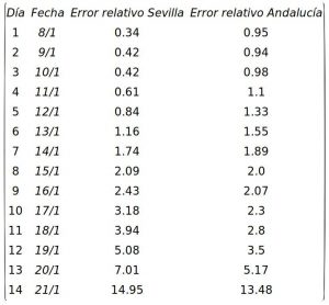
When in the post How fast are infections growing in the third wave of covid-19? we used the raw data published on 22 January to calculate the speed of the curve during the week of 15-21 January, we obtained values of 24.91 and 31.78 for Seville and Andalusia, respectively, which could not reflect reality due to the time lag in the collection and publication of the data. Therefore, we proposed to “correct” them (using the relative errors, as explained in that entry) to estimate the speed obtaining the values 46.2 and 49.27 in Seville and Andalusia, respectively. If we calculate the “real” velocity with the data published on 4 February, we obtain that the week of 15-21 January the velocity of the N14 infection curve was 37.88 in Seville and 46.32 for Andalusia. As can be seen, the estimate we made in that entry was in both cases more accurate than the value obtained using the uncorrected data. This is especially relevant in the case of Andalusia.
Let us now see what the contagion data tell us about the rate of the third wave. We will start by showing the graph of the evolution of the N14 index in Andalusia between 9 January and 2 February using the data published on 4 February to show how, indeed, the contagion curve begins to slow down. We will use the data as published (if we want to get a more accurate picture of the situation, the values for 30, 31 January, 1 and 2 February would have to be corrected upwards, but for our purposes this is sufficient):

It can be seen from the graph that as we predicted in the previous post, assuming that the growth trend continued, in two days the rate of 1000 cumulative infections in 14 days per hundred thousand inhabitants would be reached, and the graph shows that on 23 January we were already above this threshold. The graph also shows how from the 24th the curve begins to decelerate. The rates for each of the four weeks shown in the graph are shown below:
$$
\begin{array}{|c|c|c|}\hline
\mbox{ Semana }&\mbox{ Velocidad }&\mbox{ Coef. Correlación } \\ \hline
\mbox{ del 09/1 al 15/1/2021 }&51.39&0.987\\
\mbox{ del 15/1 al 21/1/2021 }&46.32&0.989\\
\mbox{ del 21/1 al 27/1/2021 }&18.86&0.943\\
\mbox{ del 27/1 al 02/2/2021 }&-11.42&0.896 \\ \hline
\end{array}
$$

The correlation worsens noticeably in the last week, which means that a straight line does not capture the trend of the N14 index evolution. The main reason for this is that between 28 and 31 January the maximum of the curve is reached and there is a large oscillation in the data values. This can be seen much better in the case of the province of Seville, for which we show the graph of the evolution of the curve, as well as the rate value in each week:
$$
\begin{array}{|c|c|c|}\hline
\mbox{ Semana }&\mbox{ Velocidad }&\mbox{ Correlación }\\ \hline
\mbox{ del 09/1 al 15/1/2021 }&39.74&0.981\\
\mbox{ del 15/1 al 21/1/2021 }&37.88&0.986\\
\mbox{ del 21/1 al 27/1/2021 }&21.03&0.965\\
\mbox{ del 27/1 al 02/2/2021 }&-5.82&0.719 \\\hline
\end{array}
$$
In this case, the speed drops notably (almost by half) the week after 21 January, so that we do not reach 1000 accumulated cases. However, there is a similar oscillation of values between 28 and 31 January as in the case of Andalusia. Note that, in both cases, it takes two weeks from the moment more restrictive measures were taken (from 9 January) until the rate starts to decrease, which corresponds to the fact that the average incubation time of the virus is estimated to be around 14 days. However, it will be some time before we know how effective these measures are, which will determine the rate of decline of the cumulative index.
As can be seen, analysis of the rate when we are not too close to the peak can give a fairly good idea of how complicated the health situation is and can help in taking (or dismissing) more restrictive measures. In any case, it is worth knowing that we still have alarmingly high rates and significant hospital pressure, not to mention the number of deaths, which remains at daily figures that are extremely worrying. The latter, and not just the number of infections, should also be taken into account when it comes to taking measures that affect us all, but which undoubtedly help to save many lives.
If you are interested in the application with the Maxima code used in this post, you can contact the author through his website by clicking here.
Leave a Reply