
Introduction
Throughout the time we have been living with covid-19, we have learned a lot about the disease, and we have even been able to design vaccines in record time thanks to unprecedented international collaboration. As we have shown in several IMUS blog posts, mathematics has also played its part. For example, in [1] and [2] we discussed, with the help of mathematics, the half-life of SARS-CoV2 outside the organism, or how far a virus can reach when sneezing, respectively. We have also devoted several posts [3] to discussing how the numbers of infected people should be used when making decisions, especially those that violate fundamental rights such as the free movement of people or freedom of assembly.
In this brief entry we will focus on a simple model to show that many of the decisions taken, particularly quarantines, were aimed at saving lives. Before going on to discuss this model, it is useful to have a short discussion on the types of models existing.
As mentioned in the book [8], there are different types of epidemiological models, ranging from the so-called toy models, which are easily understandable, modifiable and adaptable, to predictive models that are much more precise but much more complicated to understand and implement, which attempt to quantitatively predict the dynamics of an epidemic. However, as the authors of [8] rightly point out, every model is in a sense “flawed” because, even in the most complex models, simplifications and assumptions have to be made. Therefore, answering the question “what is a good model?” is always somewhat subjective.
There is a myriad of mathematical models in scientific literature that have attempted to predict the quantitative evolution of many epidemics, in particular the current covid-19 pandemic, without achieving more than partial results or predictions. The fundamental reason is that effective modelling of an epidemic such as the one we are involved in is too complex and includes a huge number of factors: age, the role of asymptomatic people, the different variants of the virus, and so on (see for example [5] and [6]). Indeed, an added problem of the current covid-19 epidemic is the lack of knowledge (or, if you prefer, the poor understanding) of, among other things, the mechanisms of virus transmission, which is critical to the successful construction of an accurate predictive model. But apart from accuracy, a model is usually required, as described in [8], to have some transparency (how the different components of the model interact with each other and how they influence the dynamics of the epidemic) and flexibility (indicating how easy it is to adapt the model to new situations). A good model should have a bit of each of these three characteristics, although in many (probably most) cases it is impossible to achieve all three. So we have to choose which of them we are willing to sacrifice. Typically, when we want to understand a certain epidemiological pattern, or the effect of certain measures, we tend to use a model that is more qualitative than predictive (the latter usually requires a huge amount of reliable data and a lot of computational power). The interested reader can find a much more thorough discussion of such models in the excellent monographs [4,8] and the paper [7], which reviews many of the epidemiological models used today.
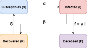
The model we are going to use is what is known in the literature as a toy model, where we will sacrifice precision (numerical adjustment) for the sake of transparency and flexibility. We will take as a starting point a model involving four agents: the population susceptible to contract the disease, the infected, who are those who have contracted the disease and are capable of transmitting it, the recovered from the disease, who are those infected that have recovered from the virus, and finally those who have died from the disease. We denote by \(S(t)\), \(I(t)\), \(R(t)\) and \(F(t)\) the number of susceptibles, infected, recovered and deceased, respectively.
Description of the model
Let’s start with a modified SIR model (a somewhat more general model, the so-called SEIR model, has been used in an IMUS blog post). We will denote by \(N\) the total number of people composing the population to be studied. We will assume that the quantities \(S(t)\), \(I(t)\) and \(R(t)\) will be driven by the following system of differential equations:
$$
\frac{dS}{dt} = -\alpha \frac{S I}N + \delta R, \qquad \,
\frac{dI}{dt} = \alpha \frac{ S I}N – \beta I, \qquad \,
\frac{dR}{dt} = \beta I – \delta R.
$$
Note that \(\frac{d(S+I+R)}{d t}=0\), so \(N\) is constant and equal to \(N(t)=S(0)+I(0)+R(0)\). This type of model is often useful when the number of deaths is small compared to the total population over the time considered.
The deceased will be treated separately. One of the reasons for not including a dynamic of the deceased \(F(t)\) is that this number can only increase, it is not possible, unlike \(S\), \(I\) and \(R\), to add some term that decreases it (in fact it would increase exponentially, which is not usually the case). Therefore, in order to compare mortality between the different scenarios we are going to consider, we will assume, for simplicity, that the number of deaths will be a proportion of those infected, \(F(t) = \gamma I(t)\); in this way, the more infected there are, the higher the number of deaths will be. Furthermore, the coefficient \(\gamma\) could be a function of time.
Thus, the parameters involved in the equations are as follows:
– \(\alpha\) is the rate of infectious contacts between infected and susceptible. The higher this number, the greater the likelihood that an infected person will transmit the disease to a susceptible. Many of the actions to be taken are intended to decrease this rate.
– \(\beta\) is the recovery rate. The higher it is, the more infected people will recover from the disease.
– \(\delta\) is the rate of loss of immunity, whereby those who have recovered move into the susceptible group.
– \(\gamma\) is the percentage of those infected who die from the virus.
It is worth noting before proceeding that the proportion of deaths, \(\gamma\), need not necessarily be a constant. For example, if there is a very large number of infected people, clearly the health system may collapse and thus increase the percentage of those infected who die from the virus, not to mention that a collapse of the health system would increase deaths among those susceptible and recovered from causes other than the virus itself but attributable to its effects.
Schematically the model can be represented as follows:
This model has two stationary solutions:
$$
{S^e_1}(t)=N(0)=S(0)+I(0)+R(0),\quad I^e_1(t)=0,\quad R^e_1(t)=0, \qquad \qquad \text{(S1)}
$$
and
\begin{equation}
S^e_2(t)=\frac{\beta}{\alpha}N,\quad
I^e_2(t)=\frac{\left(\alpha-\beta\right)\,\delta}{(\delta+\beta)\alpha}N,\quad
R^e_2(t)=\frac{(\alpha-\beta)\beta}{(\delta+\beta)\alpha}N. \qquad \qquad \text{(S2)}
\end{equation}
It is important to know that if \(\alpha\leq\beta\) then the solution (S1) is stable, i.e. the disease is controlled and disappears after a while. On the other hand, if \(\alpha>\beta\) then this solution is unstable and the solution evolves away from it. The opposite happens with the solution (S2), which is stable if \(\alpha>\beta\) and unstable if \(\alpha\leq\beta\). Thus, if \(\alpha\leq\beta\) our equations model an epidemic that disappears because \(I^1_e=0\) (see (S1)), while if \(\alpha>\beta\) the equations model an epidemic that lasts over time (endemic) because \(I^2_e>0\) (see (S2)), that is, if there is no intervention whatsoever, the disease will always be present in the population. Note that the epidemic will not disappear unless measures are taken that allow us to decrease the rate of infectious contacts \(\alpha\) (by taking measures that decrease the number of contacts for each individual, for example) or increase the rate of recovery \(\beta\) (by having effective treatments, for example) or both at the same time. This is important when taking general measures as we will see below.
Before looking at a numerical example, we should discuss how to understand the value given by each of the “boxes” in the model, as well as the time scale we are going to work with. As our intention is to show the effect of the different measures and not the fit of the model to the actual numbers of infections (i.e. we will sacrifice accuracy in favour of transparency and flexibility), we will choose a generic unit of time. That is, when we talk about 200 units of time, it does not have to be seconds, hours or days. On the other hand, we will use a computational algorithm to solve the problem numerically and we will draw the graphs at certain time values. It is clear that the graph we will obtain in this way is one very similar to that of a continuous (smooth) function which will be quite far from the graph constructed with the real data (which is usually a bar chart). Secondly, to draw the functions we will take the values as they are given to us by the numerical solution. In reality, the values have to be positive integers. So, for example, when comparing whether the measures are more or less effective, we have to look at global characteristics, such as the value and position of the maximum number of infections. Therefore, what our model will allow us to do is to find out how the infection evolves from a qualitative, not a quantitative point of view. For the latter case, there are models that are much more accurate than box models but much less tractable (see the analysis of some of them in [8]).
Let us now look at how to use the values of the \(F(t)\) function of the deceased. It is clear that the behaviour of this function will be directly related to the severity of the epidemic, both the clinical severity (e.g., large number of hospitalisations, ICU occupancy) and the social impact due to excess mortality caused by the disease. Since our model is not quantitative but qualitative, we will define a certain magnitude to give us an idea of the effectiveness of the different measures. Since we will be working numerically, what we will have is a vector \(V=(v_1,v_2,\ldots,v_L)\) with the values of the functions \(S\), \(I\) and \(R\) in a certain time interval \([t_1,t_2]\). Thus, for each vector \(V_d\) we will define the magnitude \(M_d\), (\(d=S,I,R,F\)) which will allow us to compare the severity of the epidemic as
$$
M_d := \frac{1}{L}\sum_{n=1}^L v_n, \qquad \qquad \qquad \qquad \text{(M)}
$$
where L is the number of components of the \(V_d\) vector.
Simulations
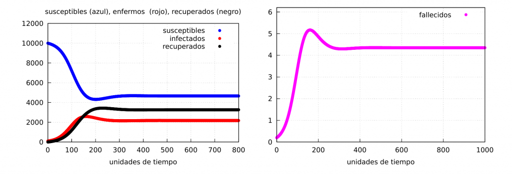
Let’s look at some numerical examples. We will start by taking the following numerical values for the parameters: \(\alpha=0.065\), \(\beta= 0.03\), \(\delta=0.02\), \(\gamma=0.002\), as well as the initial conditions \(s(0)=10000\), \(i(0)=100\) and \(r(0)=0\). In this case, \(\alpha>\beta\) and therefore the stable solution is given by the values of (S2) (case of an endemic epidemic).
$$
S^e_2(t)=4661.54,\quad
I^e_2(t)=1359.61,\quad
R^e_2(t)=4078.85.
$$
For \(t=800\) we see the graph of the solution in the following figure:
Effect on epidemic dynamics when confinements are applied
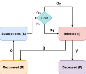
In this section we will discuss how population containment can influence the dynamics of the epidemic. There are different levels of containment, ranging from partial containment or curfews to stricter lockdowns. We are going to use generic containment, so the natural question is how to include the effect of containment in our model. This question is not easy to answer, as there are many ways to do this and all have their pros and cons. What is clear is that if there is confinement, the value of the infectious contact rate will be smaller than if there is no confinement.
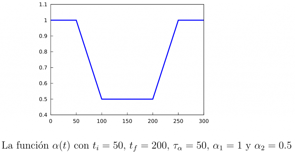
To distinguish the infection rates in both situations we will denote by \(\alpha_1\) the rate when confinement is not active, and by \(\alpha_2<\alpha_1\) the infection rate when it is active. Furthermore, it is clear that after starting the containment it still takes some time before its effects start to be seen (transition time), so we will assume that the infection rate will vary over time according to a certain function denoted by \(\alpha(t)\):
\begin{equation}\label{alpha(t)}
\alpha(t) = \left\{
\begin{array}{ll}
\alpha_1, & \mathrm{si\ } t\leq t_i, \\
\alpha_1+\dfrac{\alpha_2-\alpha_1}{\tau_{\alpha}}(t-t_i), & \mathrm{si\ } t\in [t_i,t_i+\tau_{\alpha}], \\[3mm]
\alpha_2, & \mathrm{si\ } t\in [t_i+\tau_{\alpha}, t_f], \\[3mm]
\alpha_2+\dfrac{\alpha_1-\alpha_2}{\tau_{\alpha}}(t-t_f), & \mathrm{si\ } t\in [t_f,t_f+\tau_{\alpha}], \\[3mm]
\alpha_1, & \mathrm{si\ } t\geq t_f+\tau_{\alpha}.\\
\end{array} \right.
\end{equation}
Note that in the above definition the parameters \(t_i\), which is the time at which the quarantine starts, \(t_f\), which is the time at which it ends, and \(\tau_{\alpha}\), which is the transition time we mentioned before. In the following figure we show the graph of the function \(\alpha(t)\).
Thus, our equations will be, in this case, the following:
\begin{equation}\label{mod-bas+conf}
\begin{split}
\frac{dS}{dt} = & -\alpha(t) \frac{S I}N + \delta R, \qquad \,
\frac{dI}{dt} = \alpha(t) \frac{ S I}N – \beta I, \qquad \,
\frac{dR}{dt} = \beta I – \delta R.
\end{split}
\end{equation}
In the following diagram we show how our model would look like considering confinements.
Simulations
We will take the same parameters and initial conditions as before. Let’s start with a permanent confinement. The parameters of the function \(\alpha(t)\) will be \(\tau=50\) y \(t_i=150\).
Permanent confinement: Let us start by applying confinement at time instant \(t_i\) and leaving it permanently (in our case we will simulate up to \(t=800\), so we will take \(t_f=800\)).
We will distinguish two cases:
Case I: when \(\alpha_2=0.05\). That is, a soft confinement such that at the end \(\alpha_2>\beta\), i.e., the epidemic does not end.
Case II: when \(\alpha_2=0.025\). This case corresponds to a strict confinement such that at the end \(\alpha_2<\beta\), i.e., the infection rate would fall so much that the epidemic could be ended.
Both cases are represented in the graph below:
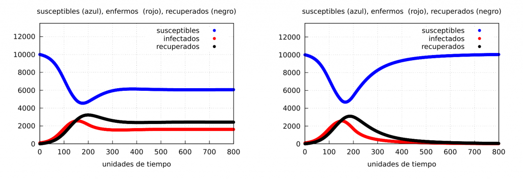
It follows from the figure above that if containment can sufficiently reduce the rate of infectious contacts so that it is lower than the recovery rate (case II), containment will end the epidemic as shown in the graph on the right. The question is how long strict containment can be maintained without too much damage to other social factors, especially the economy.
Partial confinements: Let us now see what happens if we confine for a certain period of time and then return to normality. For this we will apply the confinement at the time instant \(t_i=150\) leaving it until some final times \(t_f=300\) and \(t_f=450\), respectively, that is, when the confinement has a duration of \(\Delta t=150\) and \(300\), respectively. The results are shown in the following graphs (\(\alpha_2=0.05\)):
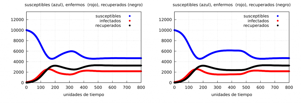
The graphs clearly show the formation of a wave of contagion (see the curve of the number of infected – red – which increases again at the end of the confinement) in both cases. Let us show the evolution of the number of deaths:
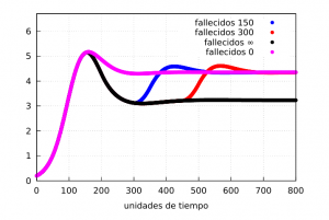
Our magnitude \(M_F\) can give us an idea of the differences in mortality in the situations discussed. From the graph it is clear that permanent confinement will have a lower rate than the other three as expected. If we calculate them using the formula (M) between the times \(t_1=200\) and \(t_2=700\) we get the values
$$
M_F^{0}=4.43,\quad
M_F^{150}=4.16,\quad
M_F^{300}=3.86,\quad
M_F^{\infty}=3.40,
$$
for the unconfined, 150 time unit, 300 time unit and indefinite confinement cases, respectively.
Finally, let’s show the evolution graphs when we have a very tight lockdown for a while and then a total relaxation (this kind of situation usually happens, as we have seen during the first wave of the covid-19 epidemic). For this we will take the same values as before and choose \(\alpha_2=0.025\) (strong confinement) and \(\Delta t=300\) time units. The results are shown in the following graph, where on the right we show the evolution of the infected when the confinement is strong (red) and when it is softer (blue), which in this case corresponds to \(\alpha_2=0.05\):
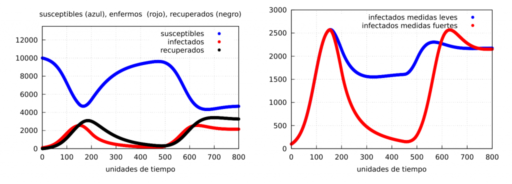
As can be seen, it can happen that, after confinement has virtually eliminated the disease, it can reappear and reach even higher peaks of infection.
Conclusions
From the qualitative results shown we can draw some interesting conclusions about the contagion dynamics of an epidemic in a population.
The first thing that can be observed is that, depending on the value of the contagion rate (\(\alpha\)) in relation to the recovery rate (\(\beta\)), there are two stationary solutions that characterise two very different scenarios.
The first scenario (let us call it scenario I) corresponds to the case of \(\alpha<\beta\), i.e. where the rate of recovery is higher than the rate of infection. As we have seen in this case, the epidemic will eventually disappear after a certain time. If, on the other hand, \(\alpha>\beta\), we enter a second scenario, where the disease will end up becoming endemic. This last case is what happens, for example, with influenza, which, given the mutations suffered by the virus that causes it, means that, in general, its contagion rate is still high enough and has not disappeared.
In this post we have focused on the second scenario and you can see how taking certain measures could, in principle, end the disease. In our case, we have focused on analysing how confinement affects the dynamics of contagion. As we have seen, if strict containment is implemented in such a way as to significantly reduce the rate of infectious contacts, we can enter scenario I and end the epidemic. In this case, the interesting thing is to effectively estimate the value of \(\alpha\) (assuming that recovery continues to take the same value) and the estimated time until it disappears, since a confinement that does not allow the mobility of people is usually a very drastic measure both politically and economically. What there is no doubt about, according to this model, is that a confinement (even a partial and non-strict one) helps to save many lives. Not to mention (since we have not included it in the model) that if the number of infected people decreases, there will be less hospital pressure (in particular less ICU occupancy) and, therefore, fewer deaths from causes not directly related to the pathogen but certainly linked to it.
Although we have restricted ourselves here to discussing confinement, there are other measures that could be modelled with the \(\alpha(t)\) function, such as the use of masks when disease transmission is via the airborne route. In fact, for both influenza and covid-19 the use of facemasks clearly reduces the value of the infection rate. The combined use of both clearly makes the value of \(\alpha_2\) lower than if only one of these two measures were applied separately.
While it is clear that confinement is a life-saving measure, the economic factor must be taken into account. If a society is paralysed, neither food nor wealth is generated and there is a clear decline in economic productivity, and that, in the long run, is not good for society either. That is why, at certain points in the evolution of the pandemic, the authorities may decide to lift the containment. However, when taking such a decision, it must be ensured that the situation is well under control and insist on consistent behaviour, or we may see, as the graphs show, spikes or waves of infection and, consequently, a new wave of deaths.
It follows from the above that in order to alter the behaviour of a virus in our society, it is essential that the population is made aware of the risks that the virus implies, as well as the need to take measures in order to reduce the rate of contagion, something that depends very much on both political representatives and the media. As a result, we must conclude that the actions we take individually in our daily lives to prevent the virus from spreading can and do have a great influence on the dynamics of infection, and that we can all work together to put an end to the virus if we behave in a civic manner.
To conclude we would like to insist once again that the present model, although very simple, is capable of capturing the dynamics of the waves of contagions that are obtained by relaxing the measures, in this case confinement, and can give a qualitative idea about the impact on mortality of the same; however it cannot, as we have already said, give quantitative data in this respect.
Programmes: The Maxima programme code used can be downloaded by clicking here.
Bibliography:
[1] R. Álvarez-Nodarse y F. J. Esteban, How long can the coronavirus last outside our body? IMUS blog, 30 March, 2020.
[2] R. Álvarez-Nodarse, F. J. Esteban y N. R. Quintero, How far does a virus go when sneezing? IMUS blog, 6 April, 2020.
[3] R. Álvarez-Nodarse, How can we understand the number of infections published daily? IMUS blog, 9 November, 2020; Morre on covid-19 infection rate, IMUS blog, 10 February, 2021.
[4] N. F. Britton, Essential Mathematical Biology, Springer, London, 2003.
[5] J. M. Gutiérrez y J. L. Varona, Analysis of covid-19 using a SEIR model, IMUS blog, 20 March, 2020.
[6] A. Doubova y E. Fernández-Cara, Age does matter, but let’s pretend it doesn’t… IMUS blog, 5 April, 2020.
[7] H. W. Hethcote, The Mathematics of Infectious Diseases, SIAM Rev. 42(4), (2000), 599–653.
[8] M. J. Keeling, P. Rohani, Modeling Infectious Diseases in Humans and Animals, Princeton University Press, Princeton, 2007.
Leave a Reply